

March 10, 2025
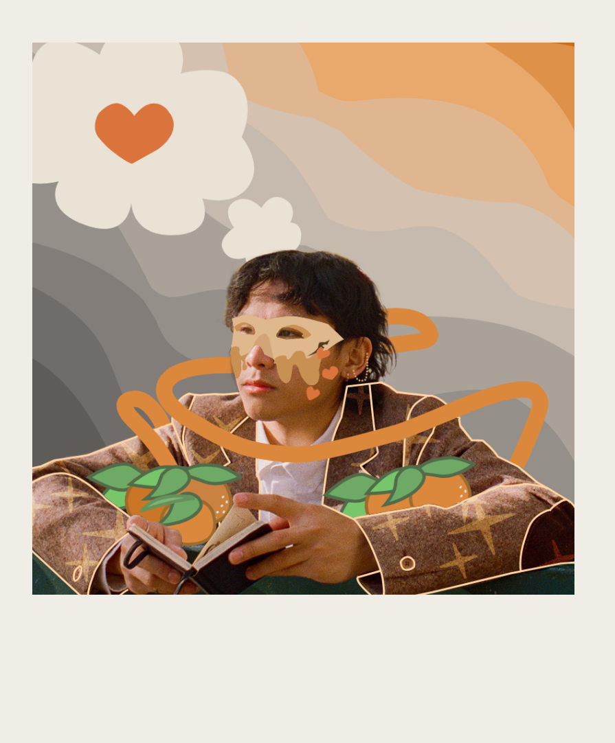
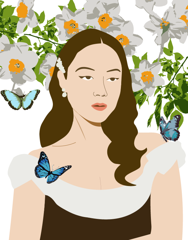
My portrait represents Laufey, who is an Icelandic artist most known for her jazz-inspired pop music. I enjoy listening to her music, especially whenever I need to calm down.
I designed my artwork by incorporating aspects of nature into the background, such as flowers, leaves, and butterflies. I placed the flowers and leaves eat the top of the artwork to fill in the empty space. I arranged the leaves behind the flowers so they would stand out and look natural. I also added butterflies on Laufey and the flowers to make the background look more incorporated into the artwork.
My artwork was mainly made using the Curvature tool to make Laufey's vector portrait more realistic. I also used the Direct Select tool and the Fill tool to make adjustments as needed. For the background vectors, I imported images of real flowers, leaves, and butterflies, and used Image Trace to make them look more simplistic to blend in with the simplicity of the portrait. I then used the Expand function to turn them into vectors.

April 11, 2025
I created my logo for a cafe because I like to relax at cafes and enjoy a cup of my favorite tea. For these reasons, I wanted the logo to express a cozy atmosphere while also maintaining professionalism. Logos are especially important for cafes to make them stand out against competitors.
I used "Baka" on "Cozy Corner" to make the logo seem more welcoming because of the handwriting-like font. I used "AWConqueror Std Stincilla" on "Brews" to add variety and professionalism since fonts similar to Times New Roman are typically used in professional settings, like in research papers or news articles. I initially designed a cup of coffee to represent the cafe and curved the text to make it more cohesive. In the second design I decided to keep it more simplistic and just added the coffee cup next to the word "brews" to fill in the empty space. I also added leaves and coffee beans to make the logo look more interesting.
I used the curvature pen and shape builder tools to create the coffee cup and latte art. I also used the gradient tool to add a gradient to the coffee cup to make its colors more cohesive with the green and brown text. I also used the curvature pen tool to create a curved path for the text. I expanded the text to individually modify each letter as necessary. For instance, I combined the leaves and the "c" in cozy using the shape builder tool and I used the direct select tool to make the tail of the "y" shorter so it wouldn't overlap with the text underneath it.
May 15, 2025
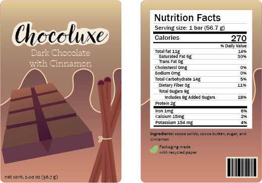
My product is a chocolate bar, specifically one that is cinnamon flavored because I believe that cinnamon would pair nicely with chocolate and add a nice spice to it. This product is made for people who enjoy experimenting with new flavors while enjoying quality chocolate.
I included the brand, flavor, and weight on the front to attract customers while I added the nutrition facts, ingredients, barcode, and packaging type on the back because they're not as exciting to look at. I added an illustration of a chocolate bar at an angle and cinnamon sticks to make it easier for customers to see what the product and flavor are. I also added shading to make them look more realistic. I added a simple design at the top of the packaging to make it stand out while not taking away from the chocolate bar and the cinnamon sticks.
My artwork was primarily made using the pen, curvature pen, and rectangle tools to create the various aspects of the product, including the chocolate, cinnamon sticks, barcode, and packaging. I also used the clipping mask tools to add details to each element, such as the shading on the chocolate. I used the text tool to create the logo and add the nutrition facts. I used the gradient tool to make the packaging look more interesting and to add more shading on the chocolate and cinnamon sticks.
June 10, 2025
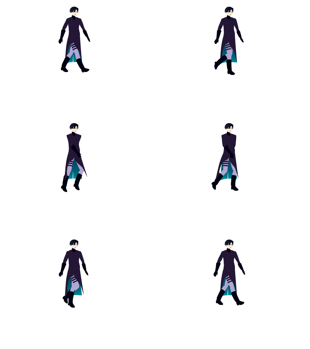
I animated a character named Ivan who is from the web series Alien Stage. I chose him because he is one of my favorite characters from the series and the outfit I chose to draw him in was fairly simple.
In Illustrator, I had to separate the different body parts based on where the joints were located (eg. forearm and bicep) so that I could move those pieces individually when animating them. To make my walk animation realistic, I referenced a keyframe sketch of a walking animation so I knew where to position the legs and feet. I also made sure to adhere to basic anatomy rules, such as limiting the joint movements properly and making sure that the arms move with the opposite legs.
The illustration itself was made using the curvature pen, the direct selection tool, and the shape builder tool to create the individual joints. In Adobe Animate, I used the transform and free transform tools to move the joints into the correct position and to adjust the rotation points. I also used the bone tool to connect the joints in my character and make him move smoothly.