
September 18, 2024
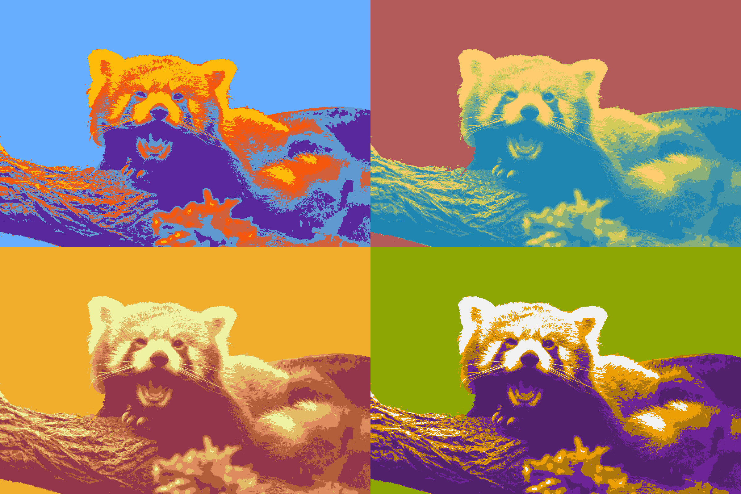
Color pop is a technique in which saturation and color contrast are used to emphasize the focal point of an image. I chose to edit an image of a red panda because I thought it would be interesting to envision what they would look like if they weren't red.
For each image, I chose to experiment with different color harmonies to add variation to my piece. I used yellow and red colors with blue and purple to create a tetradic color harmony. I used a variety of green tones and hues with a red background to create a complimentary color harmony. I also made a monochromatic image by solely using different tones of orange. Finally, I used green, purple, and orange to create a triadic color harmony.
I utilized the magic wand and gradient map tools to add color to my image after using the black and white tool and posterizing it. I selected colors from the color picker or used the hex code from Coolors to choose which colors I wanted in my image. Then, I adjusted the hue/saturation of each color individually to make them look more cohesive and stand out against the background.
November 11, 2024
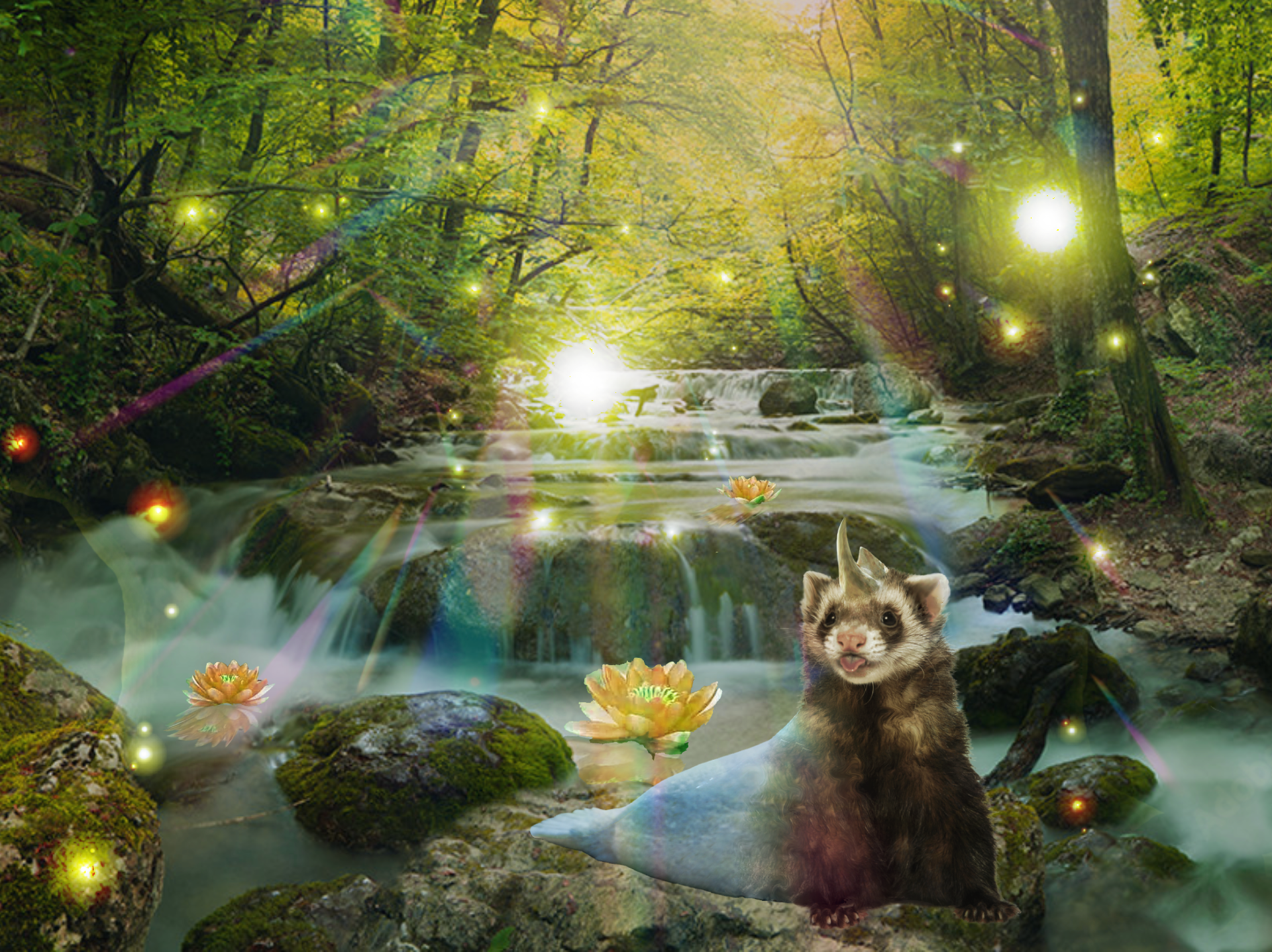
My fantastic beast is composed using parts of a ferret (head and body), seal (tail), and rhino (horn). It uses its tail to swim underwater, but is also able to live on land, which gives it a variety of places to capture prey. It uses its extended horn to protect itself from any predators in the forest.
In order to effectively show all the body parts, I decided to position the beast on land. To make it blend into the background more seamlessly, I clipped an image of a forest with yellow lighting and applied an overlay blending mode. I also adjusted the size of the beast to make it large enough to see, but not too large that it looked unnatural. To make the background more mythical, I added fireflies, a prism effect for lighting, and flowers to the water.
I used the clone stamp and patch tools to combine the different animal parts into one beast. I also used the liquefy tool to accentuate the ears and the horns. I also altered the hue and saturation of some elements to make the colors blend better together.
November 23, 2024
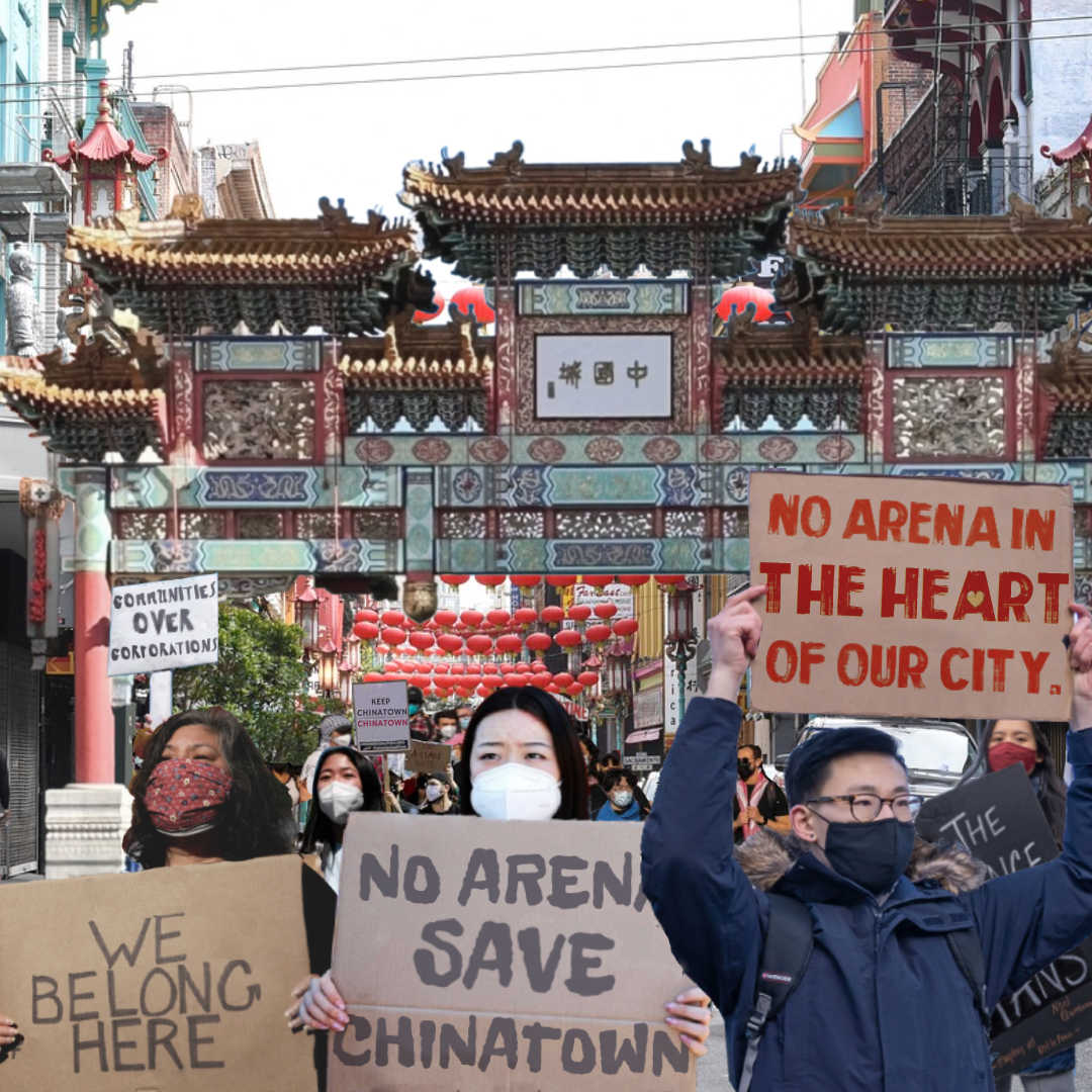
As photo-editing and AI-generated images become more prevalent in the modern world, it’s important to know how to use these tools responsibly. While they can be used to spread harmful messages, they can also advocate for social change. My fake medium aimed to bring awareness to the plans on building an arena for the 76ers’ basketball team in Philadelphia, which will be located very closeModal to Chinatown. These plans are putting many residents and businesses at risk of displacement from a town that has been deemed as a safe haven for Asian immigrants.
To make the street background look more like Chinatown, I edited in an image from a Chinatown archway. I used various images of individual protesters holding up signs for my foreground, and I used a photo of a crowd of protesters to depict a large number of people at the protest. In order to make this look convincing, I had to adjust the hue and saturation of some images, and also change the size to make the foreground protesters obvious. I also had to add new text onto the signs to make it seem like they were all protesting for the same cause. For the Instagram account, I took an image of the Save Chinatown Coalition's current profile picture to make it seem legitimate. I also sampled some of the text they used for their actual posts.
I primarily used the clone stamp and patch tools to seamlessly erase the text on the signs. I used the liquefy tool to make some members of the crowd smaller to create the illusion of depth. I used the text tool to make new phrases for the signs. I also used the lasso and magic wand tools to erase irrelevant parts of the background from the photos I used. I applied blending modes to the text to make them better blend into the sign.
October 24, 2024
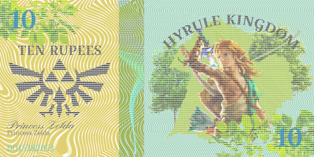
My money represents Hyrule Kingdom from the Legend of Zelda series - a game that I enjoy playing frequently. It is the main environment for all the games in the series. In the most recent games, Hyrule Castle is where the last battle of the game is fought.
I primarily used wavy patterns to create the moire patterns that were used in the background. I also incorporated analogous colors (yellow and green/blue) to make the colors blend well together. I also used a dotted halftone pattern clipped onto all the elements for an anti-forgery effect.
I used the quick selection and lasso tools to isolate certain aspects of the images I selected. I primarily used the halftone filters, but I also included the grain and sponge filters onto the mountain range. I also adjusted the hue and saturation of some images to make them more harmonious with the whole bill. I also used the color dodge and multiply blending modes to add more variety to the moire patterns.
October 24, 2024
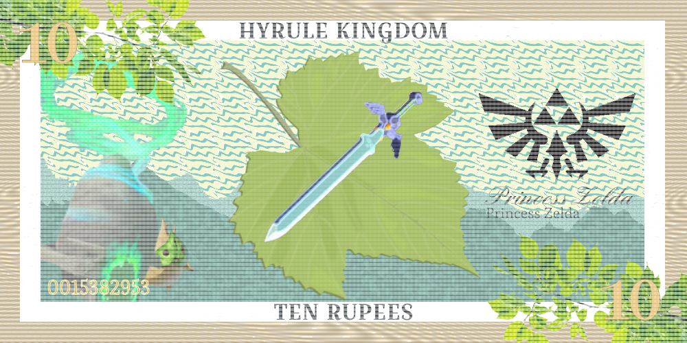
My money represents Hyrule Kingdom from the Legend of Zelda series - a game that I enjoy playing frequently. It is the main environment for all the games in the series. In the most recent games, Hyrule Castle is where the last battle of the game is fought.
I primarily used wavy patterns to create the moire patterns that were used in the background. I also incorporated analogous colors (yellow and green/blue) to make the colors blend well together. I also used a dotted halftone pattern clipped onto all the elements for an anti-forgery effect.
I used the quick selection and lasso tools to isolate certain aspects of the images I selected. I primarily used the halftone filters, but I also included the grain and sponge filters onto the mountain range. I also adjusted the hue and saturation of some images to make them more harmonious with the whole bill. I also used the color dodge and multiply blending modes to add more variety to the moire patterns.
December 12, 2024
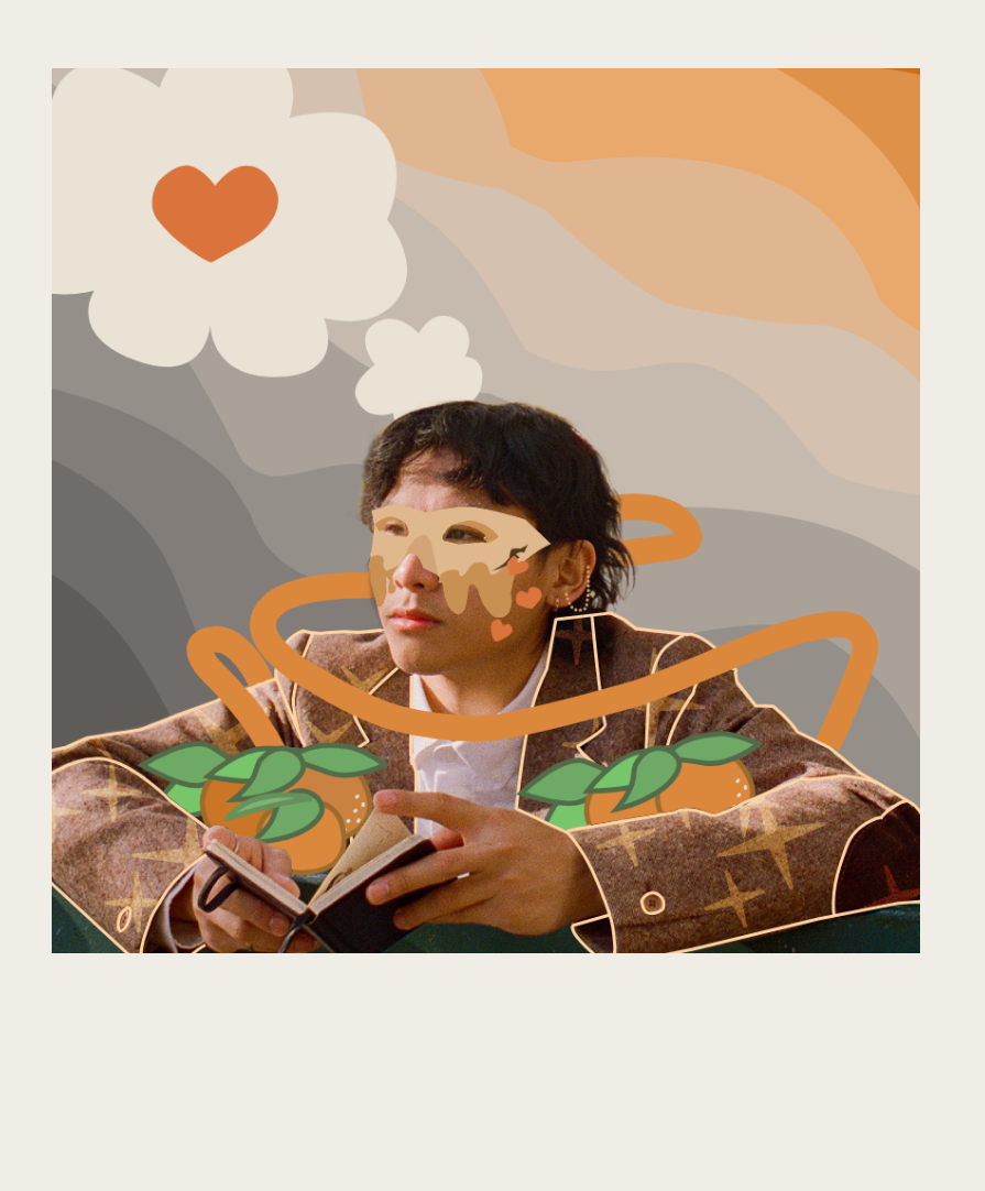
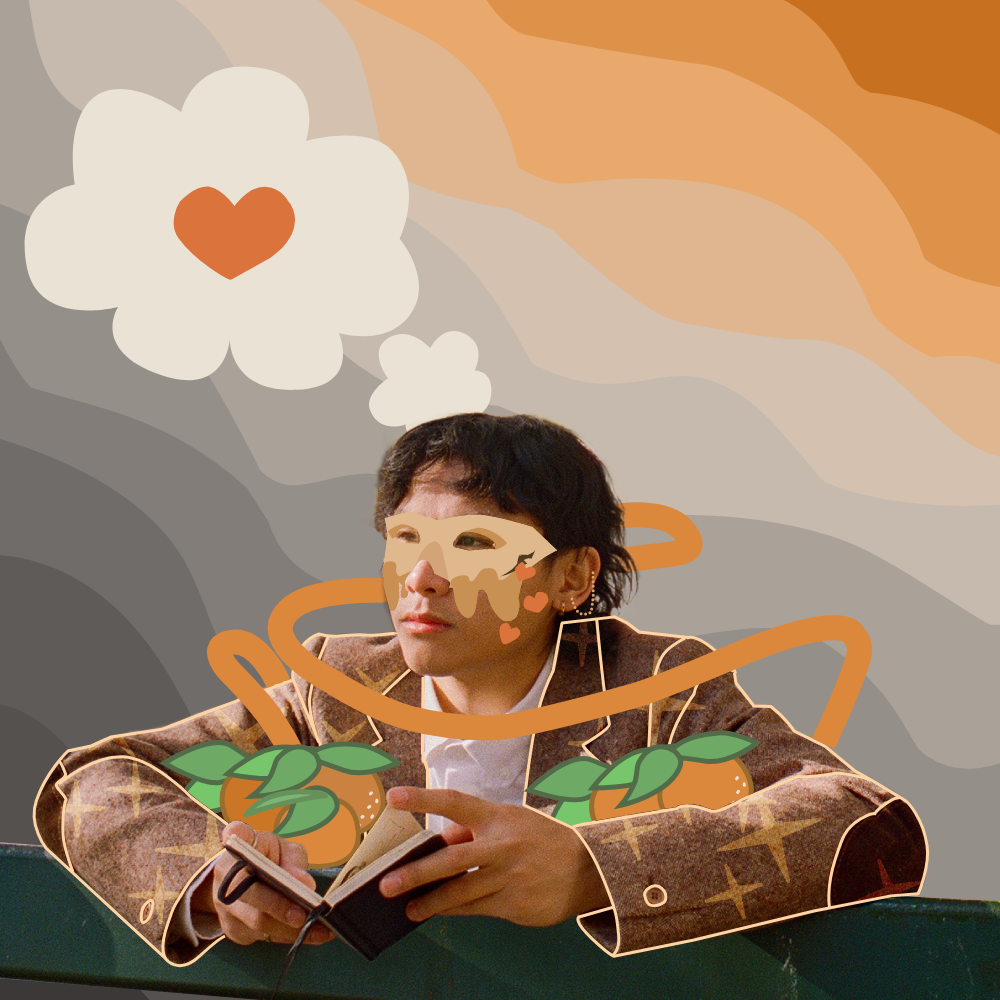
Doodlebombs are a form of digital art that involve adding vibrant illustrations on top of photos - typically of a person. My artwork is of an artist named grentperez (Grent Perez). By doodling this image of him, I wanted to create a more melancholic and reminiscent tone, inspired by his song Clementine.
To add dynamic to the background, I used curved/wavy lines that progressively got less and less saturated going down. This aimed to create a melancholic effect, since gray colors are usually associated with sadness. I added hearts to reflect the love that's described in the song. I used curved and straight lines to form his mask. The clementines in his arms were made using circles and curved lines with a pointed edge. I primarily used orange and gray colors to reflect the lyrics in the song.
My artwork was primarily made using the pen and direct select tools to form the lines and adjust them as needed. I also used the eraser tool to remove unnecessary parts and the clone stamp tool and patch tools to blend in any erased parts more seamlessly. I also used blending modes to add depth to the mask and decoration to the coat.
June 12, 2026
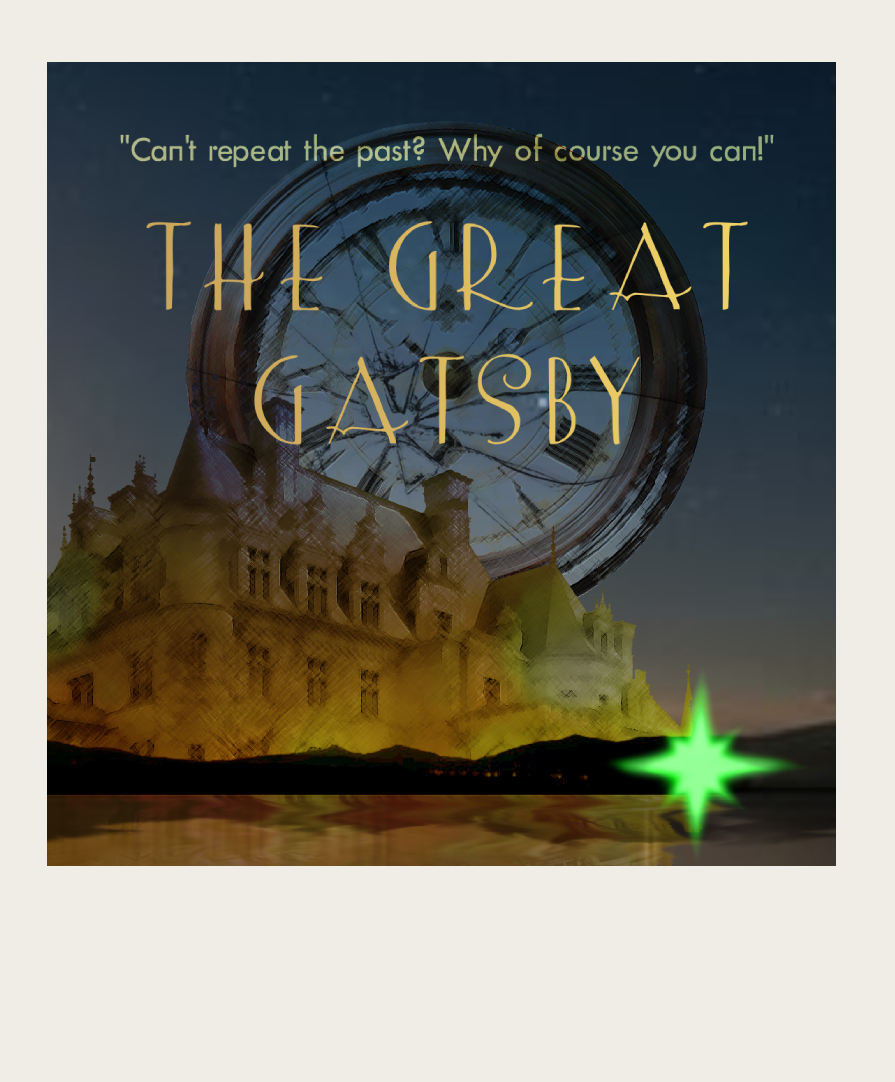
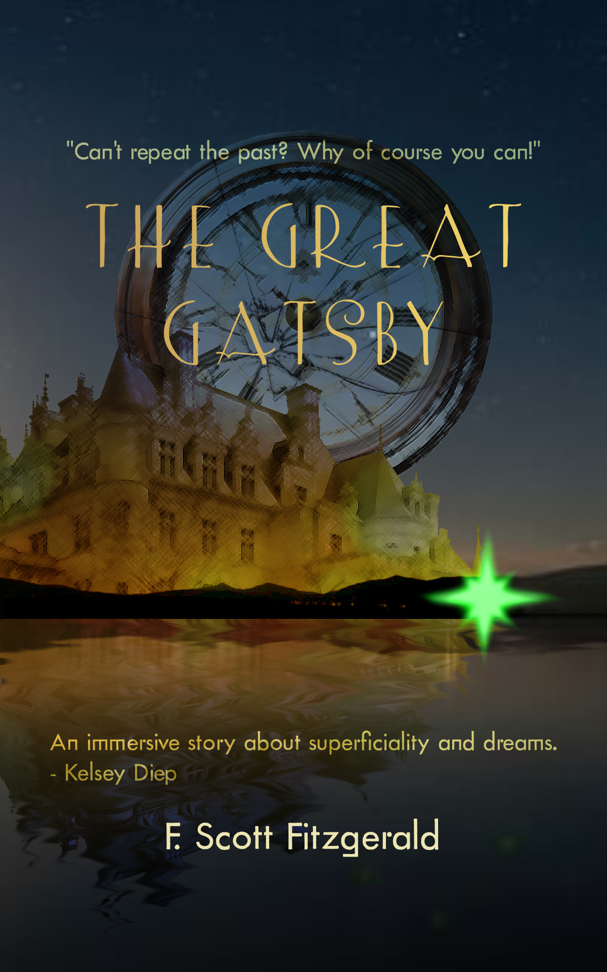
The Great Gatsby is an acclaimed novel written by F. Scott Fitzgerald about the American dream, superficiality, and wealth. In my book cover redesign, I sought to emphasize two important symbols in the novel: the green light on the dock of the Buchanan's mansion, and the clock that Gatsby broke at Nick's house.
I incorporated the green light and the clock in my book cover to symbolize Gatsby’s false hope that he could turn back time. I chose to include these symbols because Gatsby’s desire to reconcile with Daisy was his primary motivation for the actions he took in the novel: accumulating wealth through illegal means, changing his identity, and hosting extravagant parties across Daisy’s home in hope to grab her attention. Throughout the novel, Gatsby continuously attempted to chase the green light - the idea that he and Daisy could rebuild what they had when they first met. However, the broken block symbolizes how he ultimately wasn’t able to do so, despite his efforts.
I used various selection tools to isolate the images from the background. In order to make the elements more cohesive with each other, I applied the multiply, overlay, and soft light blending modes. I also applied the colored pencil filter to emulate a 1920s art style. The smudge tool was used to create both the green light and the reflection in the lake.
February 21, 2025
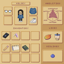
My artwork is a game inventory user interface. It includes information about the character's name, clothes, items, abilities, likes, and dislikes.
My user interface took inspiration from Stardew Valley, particularly with the color scheme and the "likes" and "dislikes" section. Most of the information in the UI is based on my preferences. I used reading patterns and size to put more emphasis on the character in my UI. I used proximity to separate the key items from the others and repetition for the inventory boxes. I also used some negative space to give more attention to the title of each section.
I primarily used Piskel to create each sprite and the character, while I used Photopea to add everything together. I added shadows and highlights by using hue shifting to make the sprites more vibrant. For the shadows, I altered the original color to a purple-blue hue; for the highlights, I changed the original to a yellow-orange color. I also made those colors darker and lighter, respectively. I designated one side of each item to have shadows and the opposite side to have highlights.
October 2, 2024
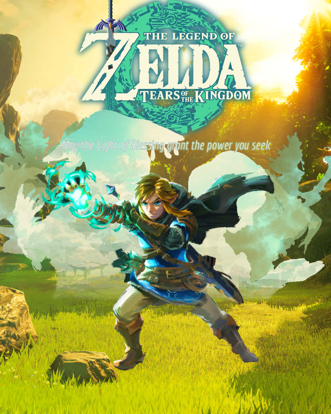
My poster promotes the game Legend of Zelda: Tears of the Kingdom. It is a game that I enjoy playing for the plot and open-world adventure experience. A unique element that was added to this game was the sky island map, which is represented by the blue hues of the characters.
My focal points are Link - the protagonist - and the Tears of the Kingdom logo. I used detail contrast and size/difference contrast to make them stand out. I purposefully used simple textures for the other six characters to make the details in Link and the logo to pop out. I also made them the largest images on the screen so the other images won't overpower them in terms of size.
I used the gradient tool to make the figures of Zelda and Rauru fade out seamlessly against the background. I also used a variety of selection tools (ie. quick selection and lasso) to remove the backgrounds of the characters. In order to make the background characters one color, I clipped a new layer to them and used the paintbrush tool to color over. I also used clipping masks to add texture to the background characters. I primarily used the color dodge and linear light blending modes to make the images blend into the characters and text more seamlessly.
January 23, 2025
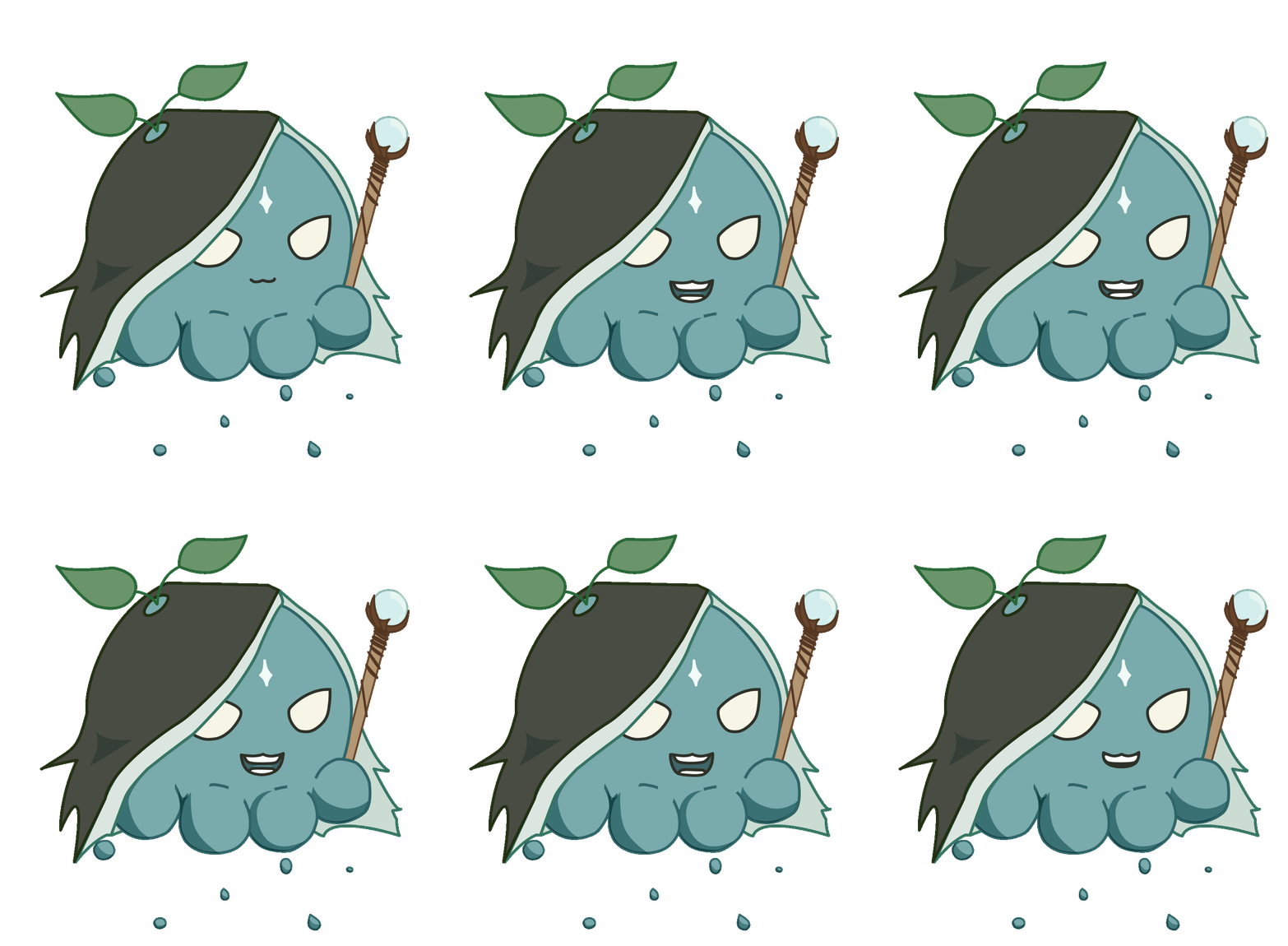
My character is an octopus that is a wandering mage of nature who is trying to learn about the source of his powers. He floats around with water particles to give him a height advantage. He warns passing travelers of the dangers of magic - especially those who are human - in fear that they will abuse their powers and hurt themselves and others in the process.
My character's body is mainly composed of round objects filled with a teal color to give him a cute appearance and make him more associated with nature. The cloak is made using black and pointed edges to make him appear mysterious. The staff is also made with some pointed edges for the same purpose. I added the water droplets and the leaves in green and teal to make him seem magical and mythical. I gave him pointed eyes to make him more serious about warning others of the dangers of magic, though in the future I would also make his mouth frown to convey this better.
My artwork was primarily made using the shape and the direct select tools. I started by tracing the body from the sketch that I uploaded, and then added the other elements on the layers on top (such as the cloak and the leaves). To add more depth, I traced the staff and made sure that its layers were behind the body.
I illustrated the mouths starting with the keyframes. To make the shapes consistent, I duplicated the sounds that made the same mouth shape. When I started designing the in-between frames, I realized that it was unnatural for the top teeth to move up and down because only the jaw moves in the mouth. In order to fix this, I made sure to keep the top teeth the same. I temporarily changed the opacity of keyframes to make it easier to adjust the in-between frames, and made sure to focus on the shape of the mouth.